Context
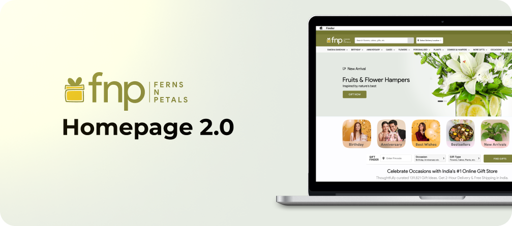
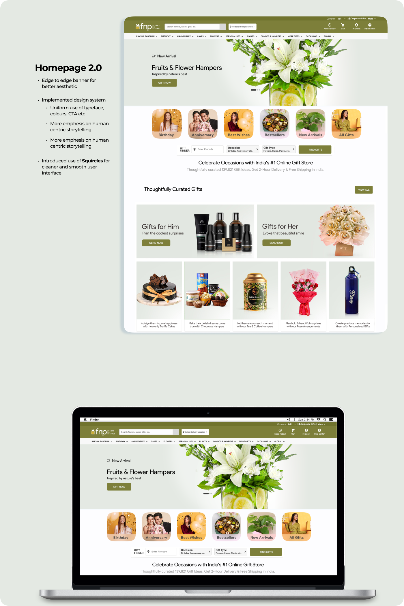
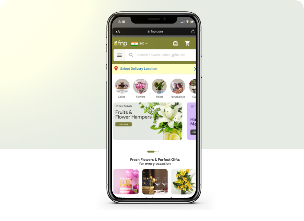
This case study compares the old and new homepage designs of the FNP (Fern & Petals) website, focusing on the improvements in usability, design, and performance metrics. The redesign aimed to enhance navigation, improve the visual hierarchy, and create a more user-friendly and modern shopping experience.
Overview
The primary goal was to enhance user experience, improve visual hierarchy, and optimize the design to align with current e-commerce trends, increase user engagement, and drive conversions.
Task
To redesign the homepage with the following objectives:
- Simplify navigation and improve product discoverability.
- Create a visually appealing, modern, and intuitive interface.
- Optimize for mobile-first usage.
- Increase engagement, reduce bounce rates, and drive conversions.
Situation
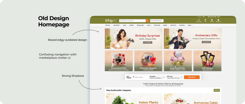
The old homepage suffered from the following challenges
Overloaded Visual Layout
- The homepage was cluttered with excessive text, visuals, and call-to-actions, leading to cognitive overload for users.
Low Discoverability
- Product categories and CTAs were not intuitive, making it hard for users to navigate and find relevant items
Outdated Design Aesthetics
- The design lacked modern UI trends, with inconsistent color palettes, dated typography, and redundant elements
Mobile Optimization Issues
- The design did not fully cater to mobile users, despite mobile being a primary traffic source
Action
The old homepage suffered from the following challenges
Research
- Conducted usability testing on the old homepage with 20 users.
- Reviewed Google Analytics data to identify bottlenecks (e.g., low engagement zones).
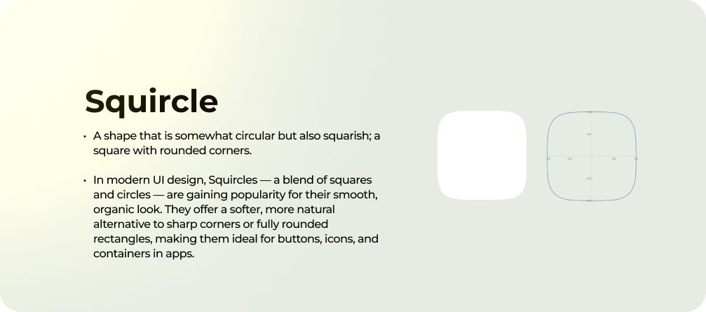
- Incorporated a clean, vibrant color scheme aligned with the brand identity.
Ideation
- Developed wireframes to simplify the layout, prioritize key categories, and enhance CTAs.
- Designed a modular layout with clear sections for product categories, banners, and promotions.
- Benchmarked competitor homepages to understand best practices in e-commerce.
Execution
- Designed a high-fidelity prototype in Figma, ensuring responsiveness for mobile and desktop.
- Collaborated with developers to implement scalable and optimized code for faster load times.
- Integrated analytics tracking for each new element (e.g., heatmaps for new CTAs)
Mobile Optimization Issues
- The design did not fully cater to mobile users, despite mobile being a primary traffic source
Testing
- Conducted A/B testing between the old and new designs to compare performance metrics.
- Gathered post-launch feedback via surveys and focus groups.
Results
The launch of DIYtv was a massive success:
- High Engagement and User Retention
Increased user Click through rate by 10% and Time spent on the Homepage page increased by 15%
- Increase in User Affinity
User feedback highlighted easier navigation and a more appealing design