Context
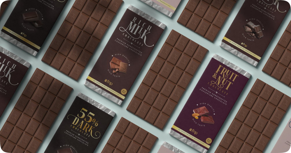
This case study explores the branding and packaging design journey for a premium handcrafted couverture chocolate brand.
The goal was to create an identity that resonated with luxury, craftsmanship, and indulgence while standing out in the competitive gourmet chocolate market.
Overview
FNP wanted to launch a private label couverture chocolate line catering to discerning customers looking for high-quality, handcrafted chocolates as part of gift hampers. The challenge was to
- Position the brand as luxurious yet artisanal.
- Differentiate it from mass-market and mid-premium chocolate brands.
- Differentiate it from mass-market and mid-premium chocolate brands.
- Ensure the packaging reflected the superior quality of the chocolate while being sustainableEnsure the packaging reflected the superior quality of the chocolate while being sustainableEnsure the packaging reflected the superior quality of the chocolate while being sustainable
- Enhance shelf appeal and storytelling through design.
Task
The project required designing an identity and packaging that
- Conveyed premium craftsmanship
- Used high-quality materials to enhance the unboxing experience.
- Incorporated eco-friendly packaging without compromising luxury.
- Created a visual identity that would be memorable in both online and offline retail.
Action
To achieve these goals, I took the following steps:
Research & Discovery:
- Market Research: Analyzed packaging trends in luxury chocolates such as Godiva, Valrhona, Lyntt and Royce.
- Competitor Benchmarking: Evaluated mass-market chocolates (e.g., Lindt) and premium artisanal brands to position ours uniquely.
Brand Identity Development
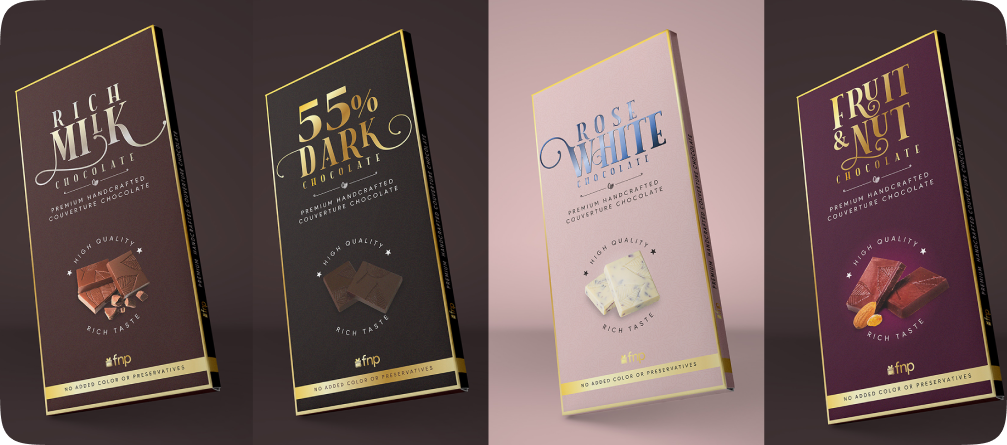
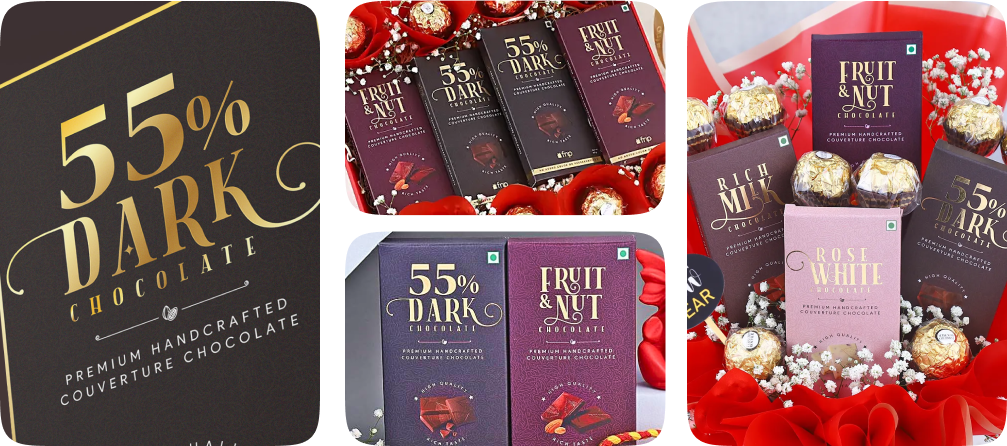
- Logo & Typography: Developed a minimalist yet elegant logotype with serif typography to emphasize heritage.
- Color Palette: Chose rich, warm hues like deep cocoa brown, gold foiling, and muted pastels for different flavors.
Packaging Design
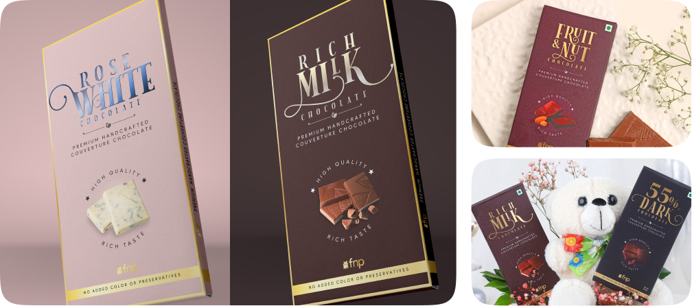
- Used textured paper with embossing to create a tactile, premium feel.
- Opted for minimal plastic, focusing on paper-based and biodegradable foil packaging.
- Gold foiling, letterpress embossing, and spot UV coatings added sophistication.
Design Execution:
- Created a striking logo and brand assets that encapsulated “TV with a Twist,” infusing movement and interactivity into the design.
- Created specific landing pages for Pre Launch, Launch, Post Launch phase
- Designed the UI/UX for the DIYtv platform, ensuring an intuitive and immersive experience for young users.
- Produced marketing collateral (digital ads, social media banners, and promotional videos) to build excitement and brand recognition pre-launch.
- Created packaging and event collaterals for events specific for influencer marketing.
- New icons were created and integrated with the existing design system.
Results
The launch of DIYtv was a massive success:
- Increased Customer Engagemen
Premium packaging resulted in a 20% higher perceived value during product testing.
- Boosted Sales & Brand Perception
: Within 3 months of launch, sales exceeded expectations, with a 15% increase in repeat purchases.
