Context
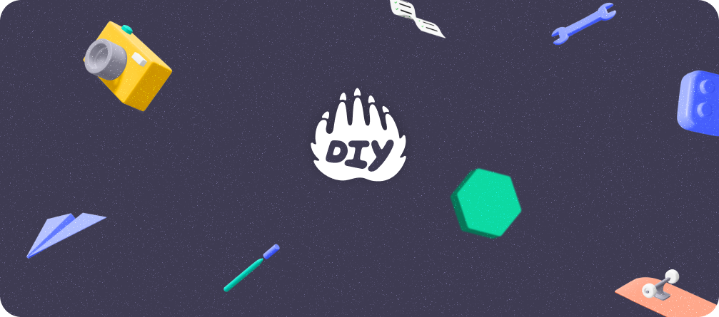
DIY.org is a creative learning platform for kids, offering a fun and interactive space where young minds explore new skills through engaging content. The brand embraces a vibrant, playful aesthetic, making learning exciting for children.
Details
Overview
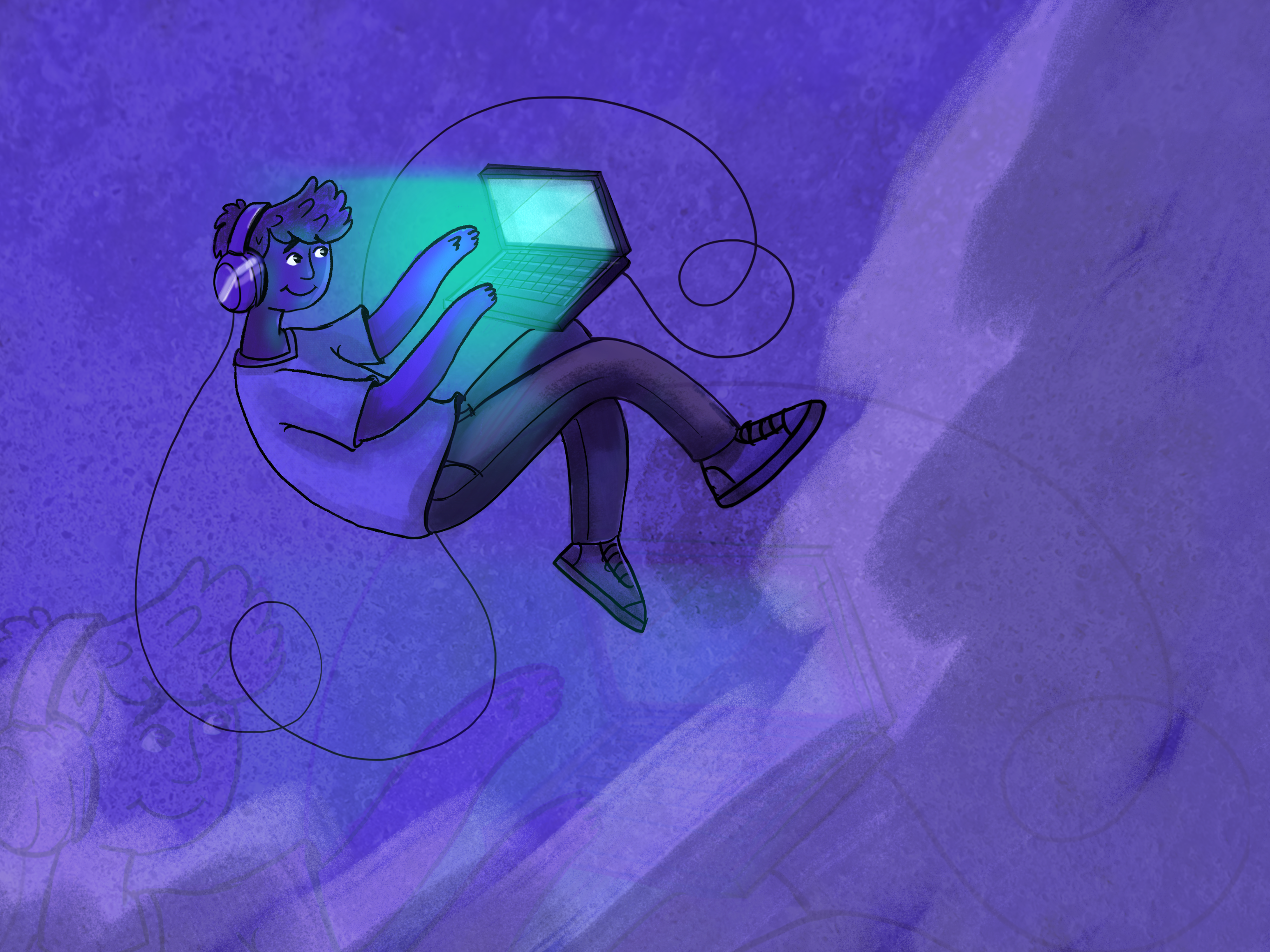
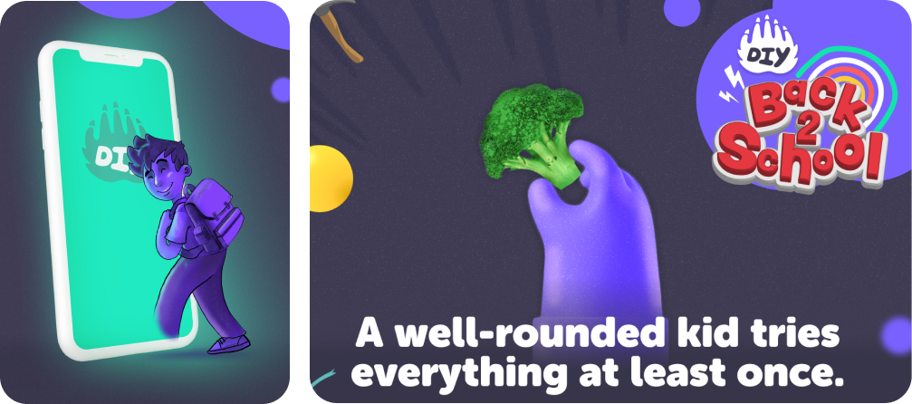
As part of a visual branding initiative, I was tasked with designing an illustration of a kid in DIY’s brand colors and aesthetics, aligning with the brand’s identity while ensuring an engaging and relatable appeal.
Task
Create an engaging, kid-friendly illustration that aligns with DIY.org’s brand aesthetics.
- Project: Illustrations for DIY Brand Aesthetics
- Industry: EdTech & Kids Learning
- My Role: Illustrator & Visual Designer
Action
To achieve these goals, I took the following steps:
Research & Discovery:
- Analyzed DIY.org’s existing branding—color schemes, typography, illustration style.
- Studied how kids respond to visuals, ensuring the illustration was relatable and engaging.
- Explored diverse representation to create an inclusive, gender-neutral character.
- Continuously monitor brand performance and customer perceptions
Concept Development:
- Sketched multiple kid characters, experimenting with expressions, outfits, and accessories that reflect DIY.org’s maker and explorer theme.
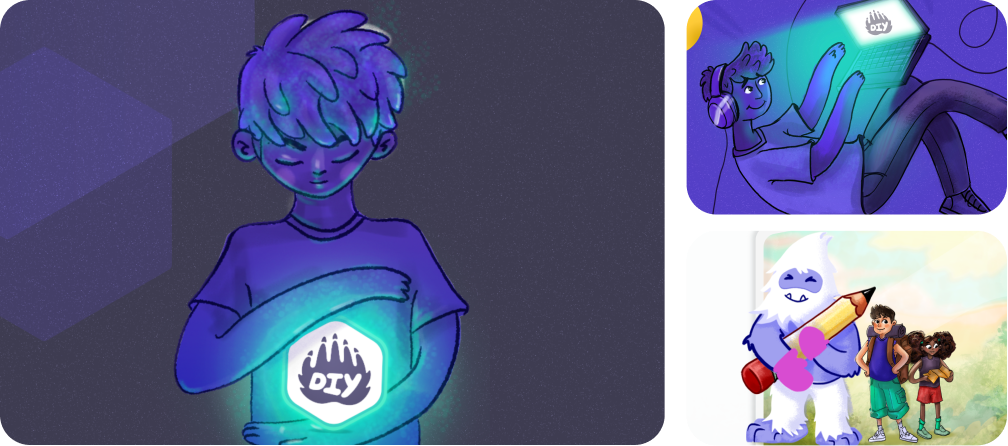
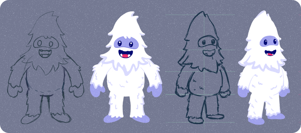
- Created a Yeti Mascot "Yowie" as well that had presence throughout app at different touchpoints
- Selected a lively pose that depicts energy, curiosity, and a sense of adventure.
- Incorporated DIY’s primary color palette—bright and friendly hues—to maintain brand consistency.
Final Illustration Execution
- Refined the sketch into a vector-based illustration to ensure scalability.
- Used soft, rounded edges to make the character approachable and kid-friendly.
- Integrated DIY-themed elements such as a toolbox, paintbrush, and gadget, symbolizing learning and creativity.
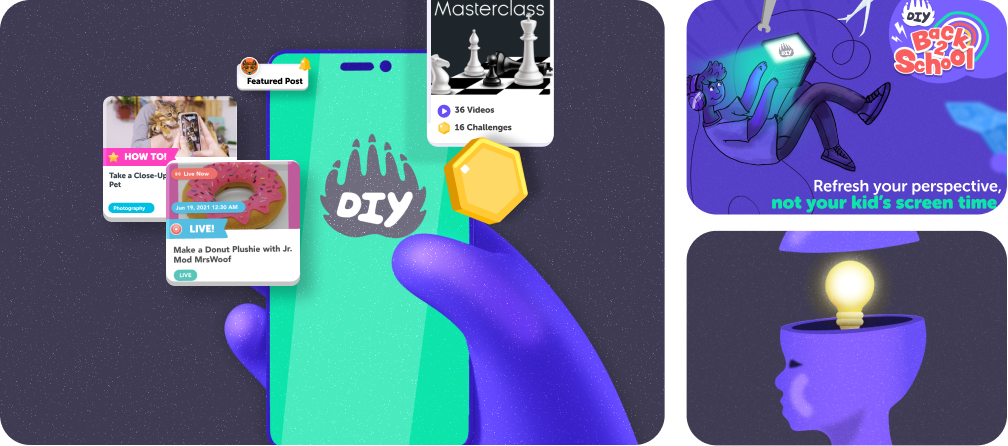
- Optimized the illustration for web, mobile, and social platforms.
- Provided variant designs (e.g., different poses, expressions) for future adaptability.
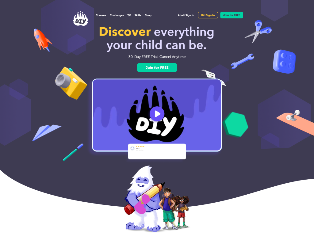
- Used the same to ensure seamless integration into DIY’s app and website interface.
Results
The kid illustration successfully elevated DIY.org’s brand appeal and engagement:
- Increased Brand Engagement
The illustrated character helped create a relatable identity, making the brand more approachable for kids.
- Seamless Brand Integration
The illustration blended perfectly with DIY’s UI, adding a friendly and playful tone.
- Versatile Asset
The illustration was used across multiple touchpoints, including the website, app, and promotional materials.
- Positive User Feedback
Parents and kids appreciated the fun, vibrant design, reinforcing DIY’s creative and educational mission.